Spotify has decided to give a - necessary - restyling to the music library of its application. The company announced a major redesign for this section of the platform, which should greatly facilitate the browsing the saved contentsbe it music or podcasts.
The goal is reduce the time users spend searching for their favorite content and increase the time they devote to listening. To do this, a number of new tools have been added that will be available is su iOS that su Android over the next week.
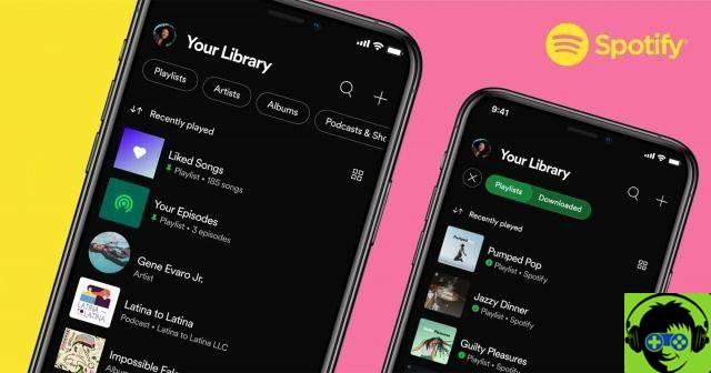
The new layout of the Spotify library makes it easier to find your downloaded songs.
Organize your music and use filters to find songs quickly with the new Spotify library
With this update, Spotify's library section didn't just get a design renewed, cleaner and more intuitive. Several have also been included functions that weren't available before and which are intended to quickly find what you want to hear at any time.
Among these functions we find dynamic filters. These filters will appear at the top of the library screen and will allow you to filter content between album, artist, playlist or podcast.
In addition, there is also the option of tap the "Downloaded" filter, to see all the contents that we have downloaded directly through the platform and that we have stored locally.
Spotify also introduces improvements in the way content is sorted. Now you can choose to view content in alphabetical order, view recently played content first, or sort by author name. To do this, you just have to touch the two arrows icon located in the upper left corner and choose the order mode.
On the other hand, an option for set up to four playlists, albums or podcasts, so that access is much faster. For correct the content, you just have to swipe right on each item and tap «correction».
Finally, one was included new view in the form of a grid, which displays library content in a more engaging format, in a gallery with larger thumbnails. For activate the grid view simply touch the icon of the four squares placed at the top right.


