Two chapters ago we started creating the component that allowed us to visualize a bar chart. However, it needed improvement, since the application user could only see a limited number of bars: the one indicated by the width of the window that contained it. In this chapter we will deal with resolving this limitation.
And for that we will use another of the controls available in the Library panel of the Xojo IDE. This is the ContainerControl.
ContainerControl is a very special control, as it is halfway between what would be a window and a simple control. Indeed, its use is the most convenient when in the design of our application it is necessary to use compound UI controls.
And what is a composite UI control? Well, we can name as such those where the combined use of several simple UI controls is required to provide a common feature or functionality.
For example, the Canvas we used for our bar chart is a simple control; but if we want to add the scrolling functionality (or horizontal and / or vertical scrolling), then we will have to add to the composition the use of another control available in the Library: the ScrollBar. Thus, the combined use of a Canvas and the ScrollBar, where each must interact on the other, forms a composite user interface control.
Now, both Canvas and ScrollBar will need a common surface that allows us to define what their design will look like in the window they are used in, and this surface is what ContainerControl provides us with.
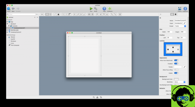
In fact, designing compound controls using the ContainerControl is similar to what we are used to doing when designing the user interface of our application windows: we just have to drag the ContainerControl from the Library to the navigation bar of the IDE (located furthest left , and which is the one that contains all the elements used in the project), to create a new instance (by default it will have the name “ContainerControl1”).
So, when we select the ContainerControl instance in the Navigator, we will access the Design Editor which will remind us very much of the same one we used in the design of the application windows.
Therefore, once we access the Design Editor for the selected ContainerControl instance, it is a matter of dragging the UI elements we want to use onto it, both from the Library and from the Navigator itself, to indicate the position and size to have.
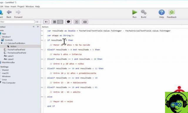
Once the design of the ContainerControl is complete, we will be able to equip it with functionality using the programming elements we know for now: properties, methods and events on the ContainerControl itself, in addition to those that have already been implemented in those controls used in its design. ; as could be the case with our class for displaying Canvas based bar charts.
Don't worry, in the video accompanying this article you will see step by step the whole process corresponding to the design of ContainerControl, as well as how you can later incorporate them into the design of the windows in which they will be used and also how all the elements are related by code.
Once completed, our ContainerControl will already have a scroll bar to perform side scrolling, so we can also see those bars that are initially hidden due to the width of the window.
In the code you will also see how the data is dynamically updated as the user interacts on the user interface. So, for example, the scroll bar will change its maximum value every time the user changes the width of the window that contains the ContainerControl instance.
In this chapter we will also continue to use the KeyDown event handler, allowing the user to also move left or right using the normal cursor keys.
-
Javier Rodriguez
Xojo engineer
Twitter: @xojoes
Facebook: http://facebook.com/xojoes/
Download the latest version from www.xojo.com
Xojo Resources in Spanish: https://docs.xojo.com/spanish


